Marie Ball Consulting Pty Ltd is a Human Resources (HR) company based in Canberra. They are an established company. In 2019 they slated having their branding redesigned. They were referred to us by another client of ours. After getting to know us, a trust-based working relationship was formed. We were then selected by Marie Ball Consulting to provide their brand redevelopment.
We have since completed the brand re-development project for Marie Ball Consulting.
The new company logo and new branding was officially launched in October 2019. Marie Ball Consulting have received great feedback from their client-base and industry as a whole. They have since granted permission for us to share their new branding here on our website, and on social media.
It was our very own Jay Daniells (the owner of Green Valley Digital) who did this logo and branding design work for Marie Ball Consulting. Jay is still very involved in all the projects we do for clients and plans to remain so for many years to come.
As per all our clients, we thank Marie Ball Consulting for choosing us as their design, marketing and digital advertising agency :).
During the brand development process we have so far created:
- Their new logo
- New Business Card
- New DL Double-sided Flyers
- New 2m Tall Pull-up Banner
We are also working on their new website atm. The scheduled launch date for their website is not until mid-December.
Below you can see some of the materials we have designed for Marie Ball Consulting so far:
![]()


In the future we will assist with other brand marketing collateral material including but not limited to:
- Video intro and exist sequences
- Videos (for web, broadcast, DVD, etc)
- Car signage if requested
- Office signage if requested
- Trade-show Sample Bags
- Trade-show Booth Posters
- Any other materials needed
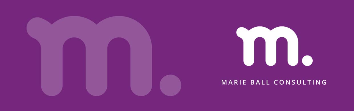
The New Logo Design:
While we, unfortunately, don’t have time to write our entire brand re-development process that we go through when doing brand development and/or logo design work with clients, we can quickly share some of our thinking behind the new logo design and the colours used. An excerpt that we supplied to the client is below:
HR, productivity improvement for the individual and teams. Curved lines symbolising nurture, roundness to express flexibility, care (the curve of caring & embracing arms) instead of harsh angled lines of ‘rigidity’. Lower-case logo graphic displaying compassion instead of ‘shouting’ heavy-handed in upper-case. A ‘ball’ (circle shape) beside the ‘m’ to tip the hat to Marie’s last name…. and also define the logo graphic by giving it a ‘full-stop’ which grounds it and reinforces authority as a consultant, teacher and mentor but still feminine.
Part of our logo design process is to always work in black, white and grey first, before exploring colours. Reasons for this are in our blog article titled, ‘Importance of having a high-quality logo‘.
Below are some images showing some of the logo design process and some of the colour options that were discussed.
When selecting colours, we always consider ‘colour psychology’. Purple was chosen as the primary colour for the new branding. Information about the colour psychology of purple is here.
This was the initial concept created in black, grey and white.
Some of the initial colour options we explored are below:
![]()
![]()
![]()
![]()
![]()

Jay Daniells has been doing advanced Search Engine Optimisation (SEO) work for clients since 2010. He is an SEO specialist. He first started doing SEO work in 2005. He has also been creating websites full-time since 2003. Amongst things Jay is also a graphic designer, digital marketing consultant and creative person. His focus is helping businesses, community groups, clubs, charities, organisations and other entities achieve their goals. He is the owner of Green Valley Digital.