The first things to note are the following:
Typically over 50% of site visitors access a website on their mobile phone (smartphone).
Two billion people access the internet only from their mobile phone.
Mobile-first design is therefore a very important strategy to employ for all digital products, including websites, apps, software, and anything else involving the internet.
In every step of the web design process, at Green Valley Digital we are not just thinking about how your website will look and function on a desktop computer or a laptop, but ALSO how it will appear and function on a mobile phone (and tablet).
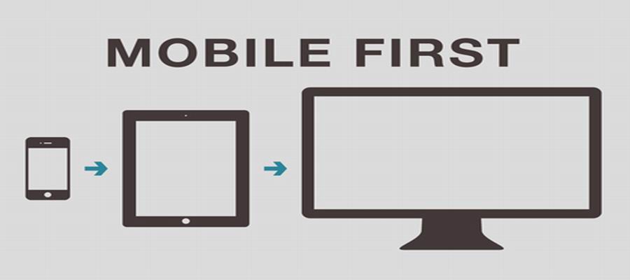
What is Mobile First Design?
Mobile-first design is a design philosophy that aims to create better experiences for device users by starting the design process considering the smallest of screens first: ‘mobile phones’. Designing and prototyping your websites for mobile devices right from the early concept stages helps you ensure that your users’ experience is seamless on any device.
The mobile-first design idea first came into the limelight in 2010 when Eric Schmidt, then-CEO of Google, announced at a conference that the company would be focusing more on mobile users in their design practices. Mr Schmidt said:
———————–
“What’s really important right now is to get the mobile architecture right. Mobile will ultimately be the way you provision most of your services. The way I like to put it is, the answer should always be mobile-first. You should always put your best team and your best app on your mobile app.”
———————–
Why is it Important?
Some of the reasons include:
- Designing for a mobile device (phone or tablet) is more limited than say, designing for a desktop computer. After all, you’re designing for a smaller screen and can only fit so many elements into it. That means you choose only what’s most important — what your users need the most — while ignoring everything else.
- Your webpages will still load faster, especially on slower internet connections like 3G.
- You can be confident that your site visitors who are accessing your website on a mobile phone, can easily read, navigate and interact with your website.
- It’s putting the right step forward if you care about your website being found in ‘mobile search’ (as in, ‘Google Mobile Search SEO‘) which is essential if you want your website to perform well and become the greatest asset to your business that it can be.
For more information about Mobile-first design read this article:

Jay Daniells has been doing advanced Search Engine Optimisation (SEO) work for clients since 2010. He is an SEO specialist. He first started doing SEO work in 2005. He has also been creating websites full-time since 2003. Amongst things Jay is also a graphic designer, digital marketing consultant and creative person. His focus is helping businesses, community groups, clubs, charities, organisations and other entities achieve their goals. He is the owner of Green Valley Digital.